
Workline
Workline is a dynamic HR tech platform that empowers organizations with highly configurable and scalable HR management tools. Despite offering a wide range of features across the employee lifecycle, Workline faced significant UX and interface challenges that hindered adoption and usability.

The homepage brings frequently used actions forward, so users don’t have to go looking for what they already know they need.

We started by reducing friction.
The App

We designed it to show rich employee data at a glance, without overwhelming the viewer or forcing endless scrolling.
.png)
This screen was about balance.

We kept learning and action in one place, so users feel informed and supported before they submit anything.

For whistleblowing, clarity and trust mattered most.

List and card views let users choose how they want to scan information, supported by light, custom illustrations.

For advance claims, flexibility mattered.


We stripped the flow down to what matters, so candidates can start an application without second-guessing where to begin.


Here, the goal was momentum.


Clear filters, clean layouts, and simple actions help candidates find the right role without friction.


This screen was designed for browsing.


The layout helps candidates understand the role quickly and act without losing context.


We brought key information and actions to the top.
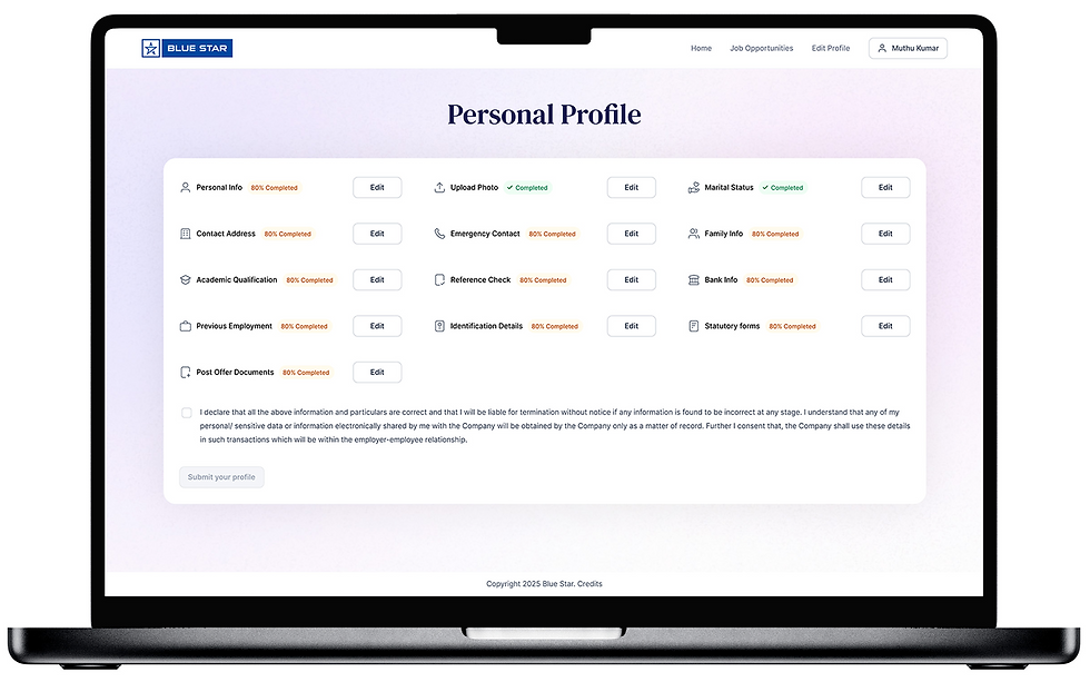

We grouped information thoughtfully so updating details feels straightforward, not like filling out a form maze.


This screen is about structure.


Status, next steps, and key actions are visible at a glance.


We designed this to answer one question clearly: “Where do I stand?”


Bills look like bills, statuses are easy to spot, and nothing feels buried.


For reimbursements, we leaned into real-world cues.


Our focus was on hierarchy and clarity, so approvers can review, compare, and decide without cognitive overload.


This screen handles a lot of data.